CAPRA - News of Course

Motion Graphics / Publication Design / Branding / UI Design

A digital editorial redesign for a professional regulatory affairs publication, built to improve clarity, structure, and visual engagement across complex industry content.
Project description:
CAPRA NOC is a digital editorial redesign for a professional regulatory affairs publication, created to improve clarity, structure, and visual engagement across complex industry content.
The project focused on redesigning News of Course, CAPRA’s professional regulatory affairs magazine, into a more structured, contemporary, and scalable editorial system. The publication needed to support dense technical content, recurring articles, contributor information, industry news, committee messages, feature stories, calls for authors, and member updates while still feeling organized, credible, and engaging for a professional audience.
Project Overview

CAPRA’s NOC magazine required a stronger editorial system that could make complex regulatory affairs content easier to navigate and more visually compelling.
The existing publication needed clearer hierarchy, more consistent article structures, stronger sectioning, and a more contemporary digital reading experience. Because the content often includes regulatory analysis, industry updates, long-form articles, references, contributor information, and organizational messaging, the redesign needed to balance professionalism with readability.

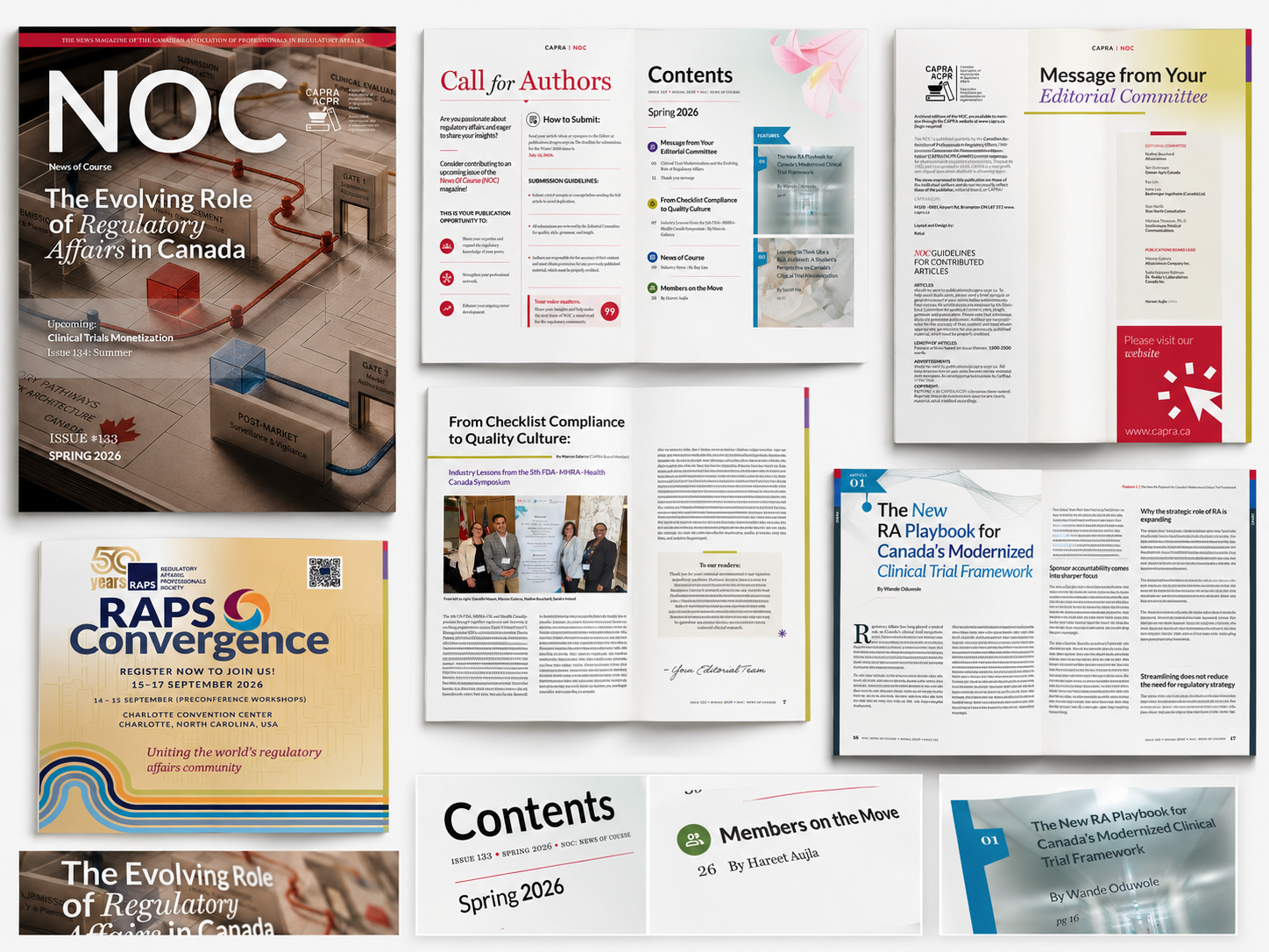
I developed a redesigned publication approach that included cover direction, article layouts, editorial openers, recurring section structures, typography direction, hierarchy, section markers, contributor sidebars, callout boxes, and scalable templates for future issues.
The goal was to create a publication system that felt credible, organized, and visually engaging while supporting CAPRA’s role as a trusted voice in the Canadian regulatory affairs community.
My Role
Editorial Designer / Layout Designer / Visual Systems Designer
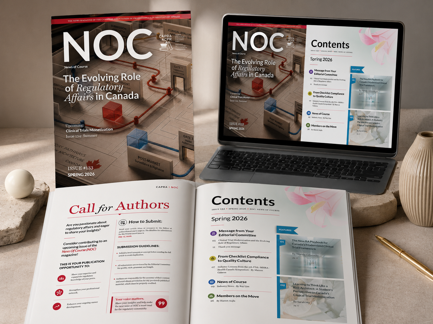
I led the visual redesign and layout development for CAPRA NOC Issue 133, including the editorial system, page structures, typographic hierarchy, article templates, and digital publication presentation.

My responsibilities included:

- Redesigning the publication’s visual and editorial structure
- Creating a more contemporary layout system for professional regulatory content
Developing reusable templates for recurring sections and article types
Establishing typographic hierarchy for long-form reading
Designing editorial openers, contents pages, feature layouts, and member sections
Creating structured layouts for industry news, contributor information, references, and callouts
Improving readability, consistency, navigation, and visual pacing across the issue
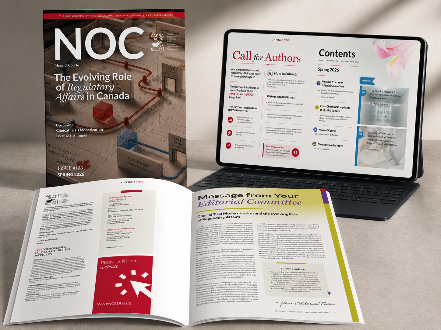
Preparing the publication for digital viewing and future issue scalability
The Challenge

The main challenge was designing for content that is dense, technical, and highly professional without making the publication feel heavy or difficult to read.
Regulatory affairs content often carries a high level of complexity. Articles may include policy analysis, clinical trial modernization, symposium summaries, references, contributor notes, industry updates, and organizational messaging. Without a strong editorial system, this type of content can easily become visually flat or overwhelming.

The redesign needed to answer a clear design problem:
How can a professional regulatory affairs publication feel more structured, readable, and visually engaging without losing its credibility or seriousness?
Design Approach

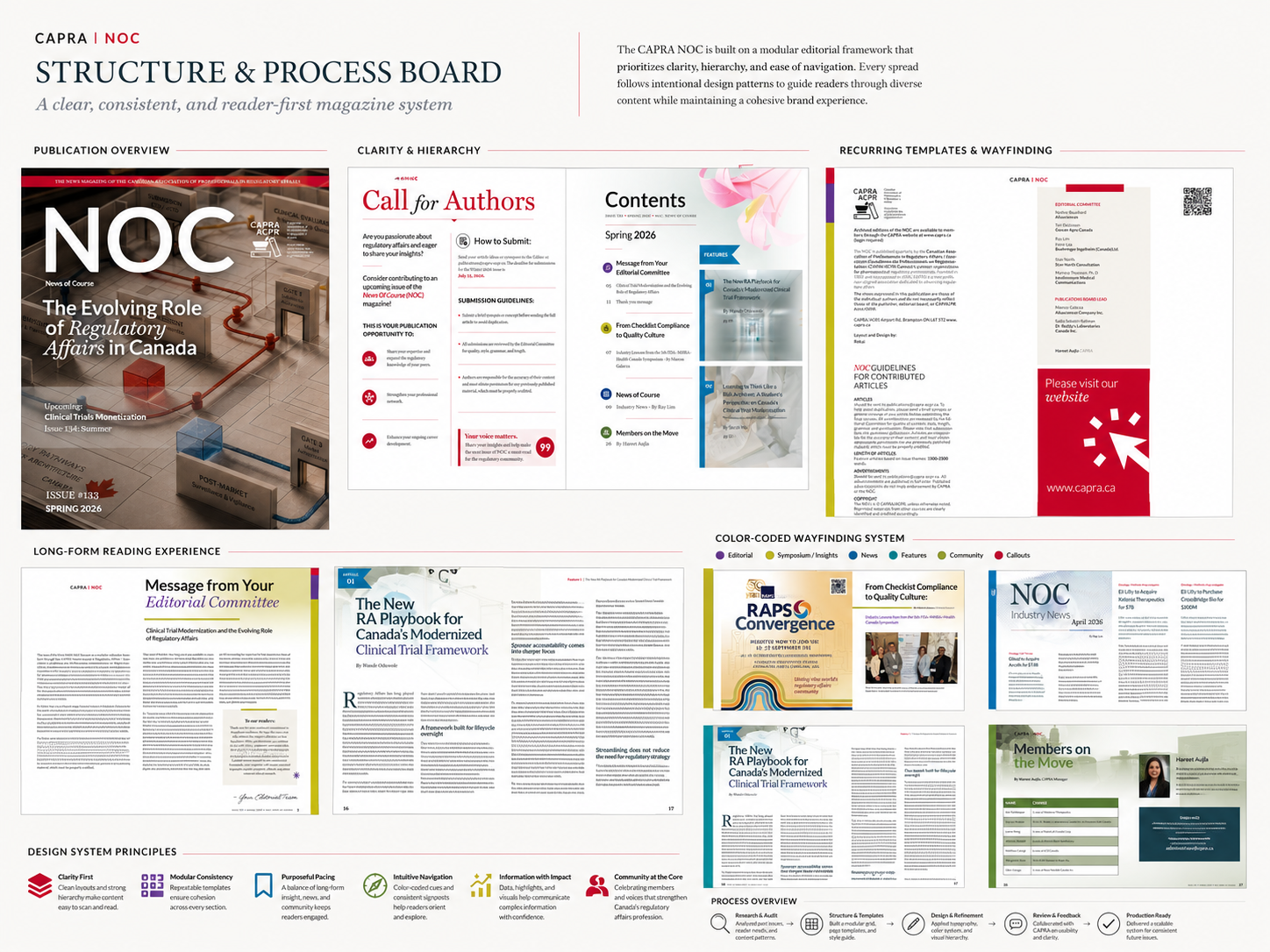
My approach was to treat NOC as a complete editorial system rather than a collection of individual pages.
I focused on building a repeatable structure that could support different types of content while maintaining visual consistency across the publication. This included defining clearer rules for headings, subheadings, article openers, section labels, margins, columns, pull quotes, contributor information, and recurring page elements.
The visual direction needed to feel professional, contemporary, and trustworthy. I used clean typographic contrast, structured grids, colour-coded wayfinding, generous spacing, and recurring editorial devices to help readers understand where they are in the publication and how each section relates to the larger issue.
The result is a system that improves navigation and readability while giving CAPRA NOC a stronger editorial presence.
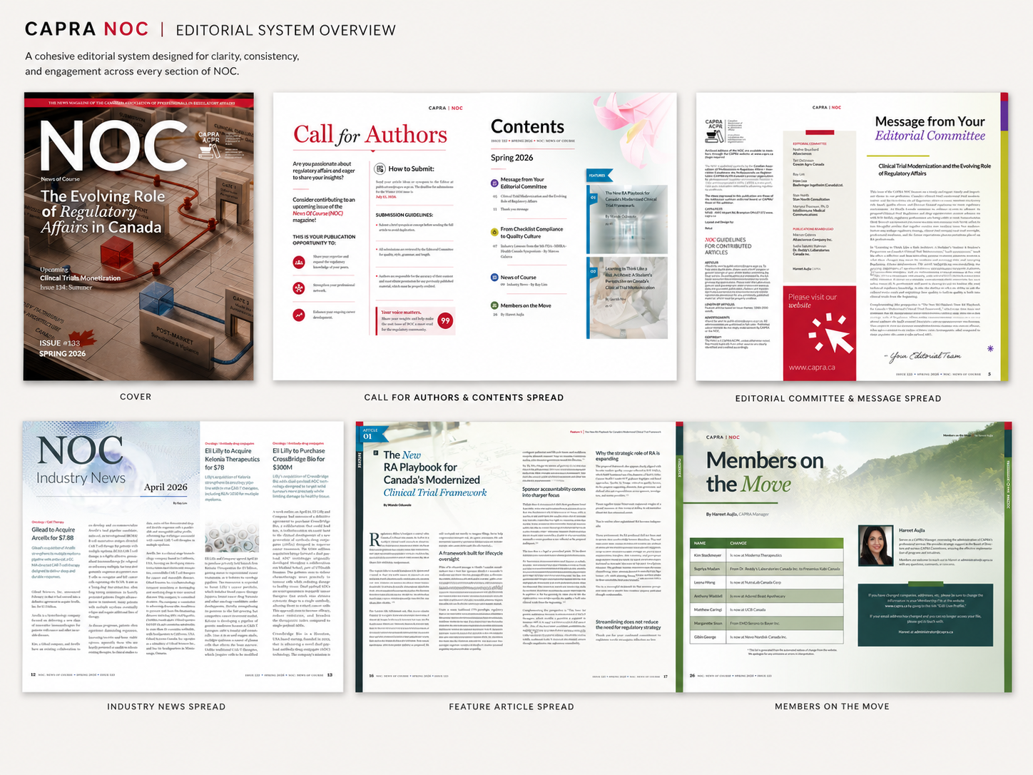
The redesigned system included multiple page types and recurring structures, including:

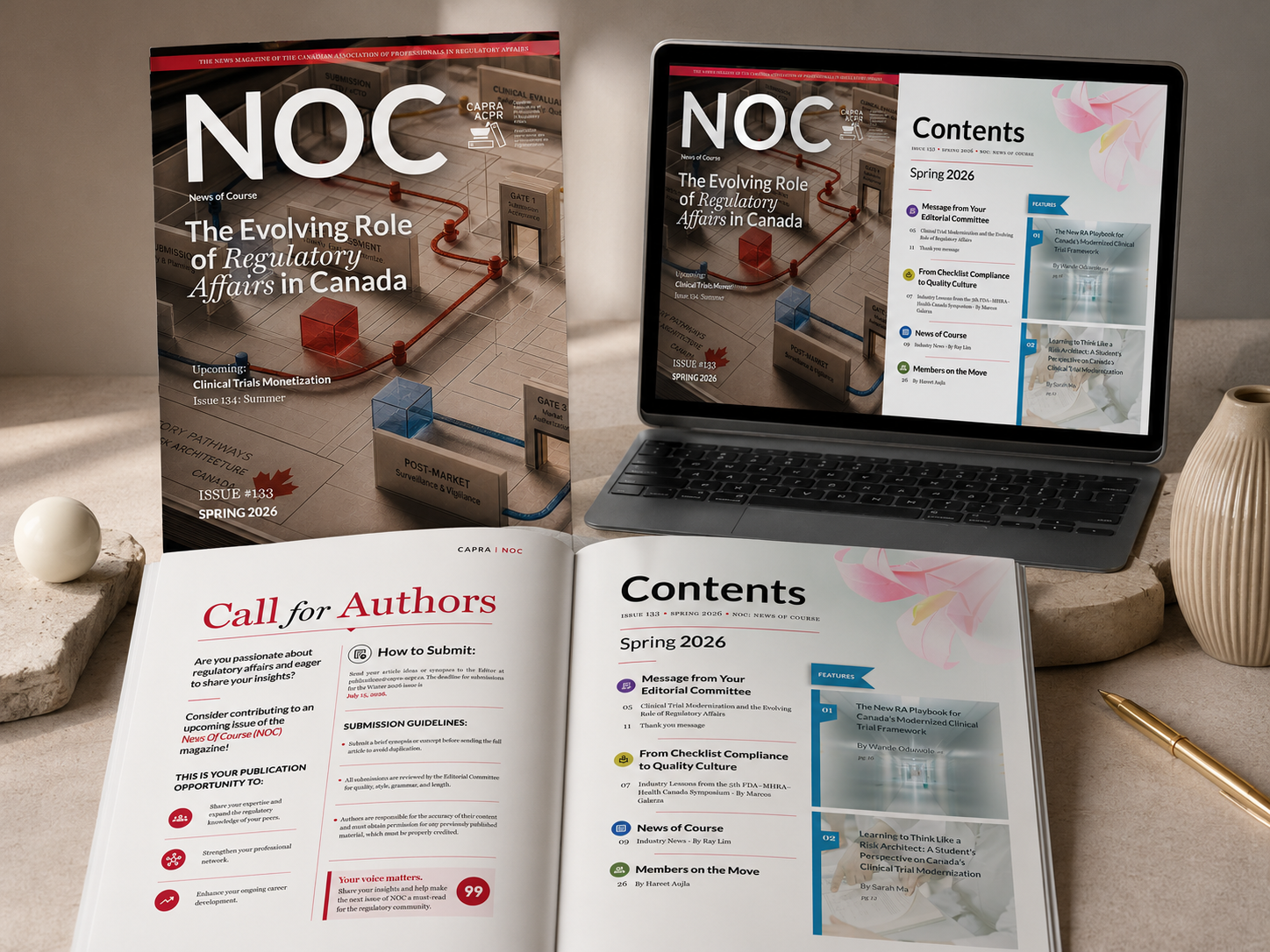
1. Cover design
2. Call for Authors page
3. Contents page
4. Editorial Committee message
5. CAPRA/NOC guidelines page
6. Symposium article layout

Each layout was designed to feel distinct enough to support the content type, while still belonging to the same publication family.
7. Industry News section
8. Feature article opener
9. Long-form feature article pages
10. References pages
11. Contributor biography layouts
12. Members on the Move section
13. Closing call-to-action page
Typography and Hierarchy

The publication needed to support long-form reading, quick scanning, and clear section recognition. I used a structured typographic hierarchy to separate issue titles, section labels, article headlines, bylines, subheadings, captions, references, pull quotes, and body copy.
The goal was to help readers move through complex information more comfortably.
Large article titles create editorial impact, while smaller navigational elements help readers understand section placement. Drop caps, callout boxes, and coloured rules add rhythm to dense pages without making them feel decorative or distracting.
Layout and Readability

The page layouts were built around clarity and pacing.
For long-form articles, I used structured columns, consistent margins, visual breaks, and callout moments to avoid overwhelming the reader. Feature articles were given stronger openers and recurring side markers so they could feel more elevated within the issue.
For sections like Industry News and Members on the Move, the layouts were designed for faster scanning. These pages use clearer grouping, colour-coded labels, tables, and section-based structures to make information easier to absorb.
The redesign supports both deep reading and quick reference.
Visual Language

The visual system combines editorial restraint with professional energy.
The design uses a clean structure, confident typography, and controlled colour accents to create a polished publication experience. Red, blue, green, purple, and yellow accents are used strategically for sectioning, emphasis, and wayfinding.
The cover introduces a more conceptual visual direction, using regulatory pathways, gates, cubes, and structured movement to represent the evolving role of regulatory affairs in Canada. This visual language gives the issue a stronger thematic identity while remaining appropriate for a professional audience.
Key Design Decisions
A structured contents system
The contents page was redesigned to help readers understand the issue at a glance. Featured articles, recurring sections, page numbers, and editorial categories are visually separated so readers can scan the issue more easily.
Stronger article openers
Feature articles were given more editorial weight through larger headlines, article numbering, section labels, and clearer entry points. This helps important pieces feel intentional and prominent.
Colour-coded wayfinding
Recurring section colours and side markers help readers navigate the publication and distinguish article types, news sections, feature stories, and member updates.
Better support for dense content
Long-form articles were structured with columns, subheadings, pull quotes, image placements, references, and contributor information to improve pacing and reduce visual fatigue.
Scalable templates
The system was designed so future issues could use the same structure without needing to reinvent the layout each time. This makes the redesign practical, repeatable, and sustainable.
Final Outcome

The final redesigned issue created a more polished, structured, and contemporary editorial experience for CAPRA NOC.
The publication now has a clearer visual identity, stronger editorial hierarchy, more consistent page structures, and improved readability across complex regulatory affairs content. The redesign also gives CAPRA a more professional and scalable publication system that can support future issues, recurring sections, contributors, and industry updates.
This project demonstrates my ability to design for complex information, professional audiences, long-form editorial systems, and brand credibility. It also reflects my strength in transforming dense content into a more accessible, organized, and visually engaging publication experience.
Reflection

CAPRA NOC was an opportunity to design with both precision and restraint.
The challenge was not to make the publication overly decorative. The challenge was to make complex regulatory content feel clearer, more credible, and easier to engage with. This required careful attention to hierarchy, typography, content structure, pacing, and editorial consistency.
If I were to continue evolving the system, I would build a complete editorial style guide for future contributors and designers, including article templates, typography rules, image treatment, accessibility considerations, and digital publishing specifications.
The larger value of this project is that it shows how strong editorial design can elevate professional content. Good structure does not simplify the subject matter; it helps the reader move through it with more confidence.

View more

Back to Top