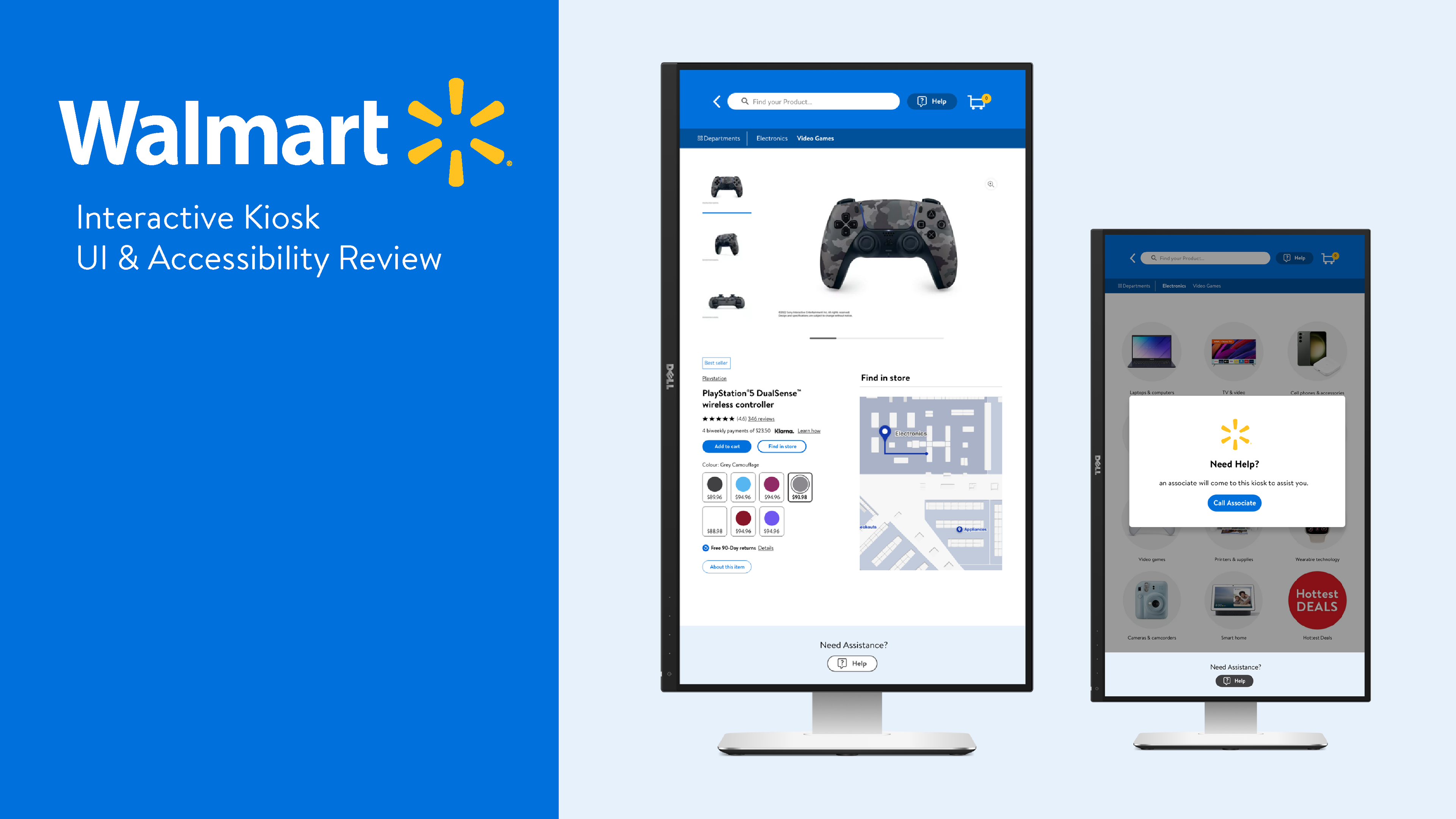
Enhancing User Experience:
Implementing Best UI Practices in Accordance with Walmart's Brand Guidelines and Design System
Overview
While collaborating with Cineplex Digital Media, I was brought in to review and refine the interface design for Walmart’s in-store interactive kiosk app.
The development team needed UI and accessibility expertise to ensure the prototype aligned with Walmart’s global brand guidelines and AODA compliance standards.
This project aimed to create a seamless and inclusive self-serve shopping experience for users across diverse physical and digital contexts.
Challenge
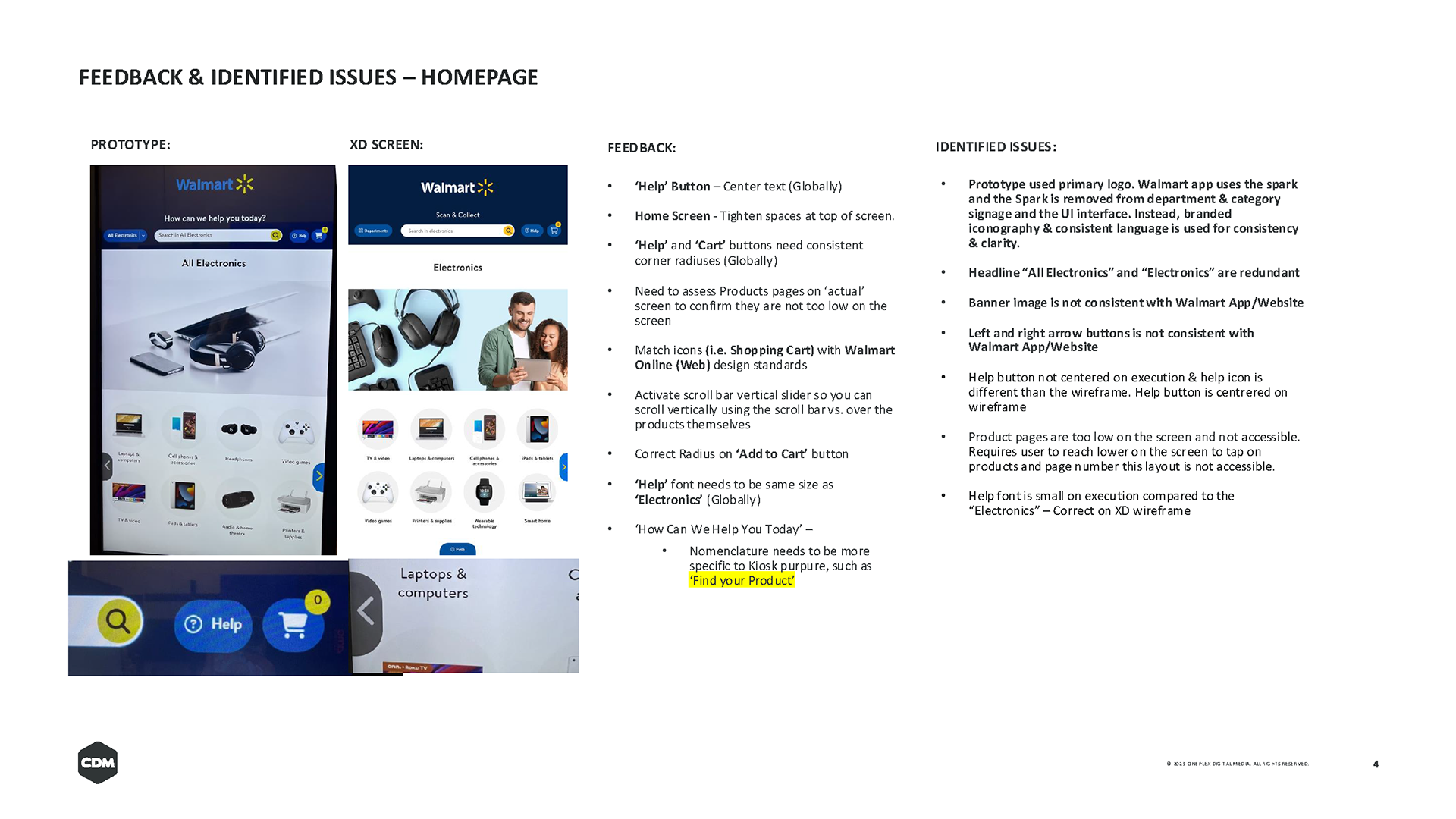
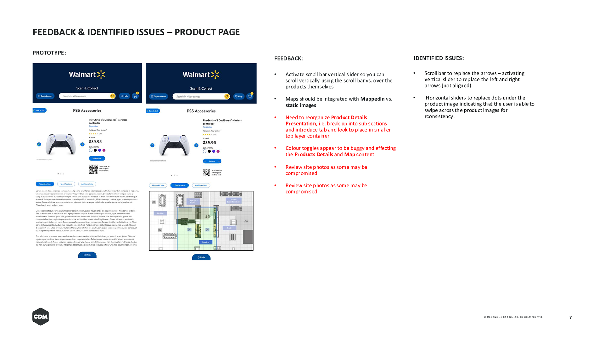
The prototype had strong functionality but lacked alignment with Walmart’s digital design system and accessibility best practices. The kiosk interface needed visual consistency, clearer hierarchy, and improved touch ergonomics to support diverse users interacting on large vertical screens.
Scope of Work
- Conducted a UI and accessibility audit of the kiosk prototype.
- Identified visual inconsistencies, layout inefficiencies, and navigation pain points.
- Reviewed touch-target reach, contrast levels, and font hierarchy for AODA compliance.
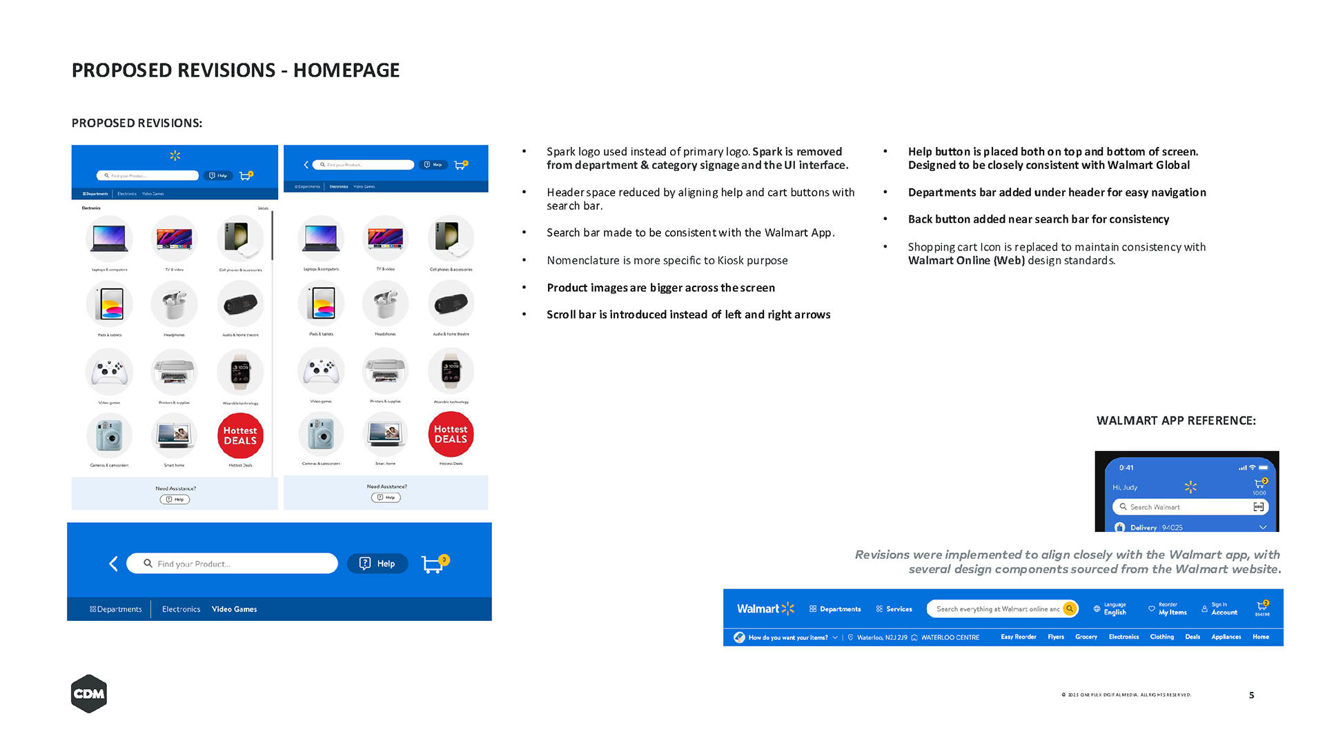
- Developed a UI design system and style guide in Adobe XD, using Walmart’s core branding, Bogle typography, and digital standards.
- Collaborated directly with developers and creative leads to ensure implementation fidelity.
My Role
UI & Accessibility Designer
I provided design recommendations grounded in accessibility and user-centered design principles, translating Walmart’s visual language into scalable components for kiosk use.
I provided design recommendations grounded in accessibility and user-centered design principles, translating Walmart’s visual language into scalable components for kiosk use.
Process
1. Audit & Analysis
I began by reviewing the kiosk prototype in-office to observe real interaction flows.
Key findings included:
Inconsistent icon sizing and spacing.
Text contrast below AODA minimums in several screens.
Inaccessible touch targets for key navigation buttons.
Inconsistent use of Walmart’s color palette and typographic rhythm.
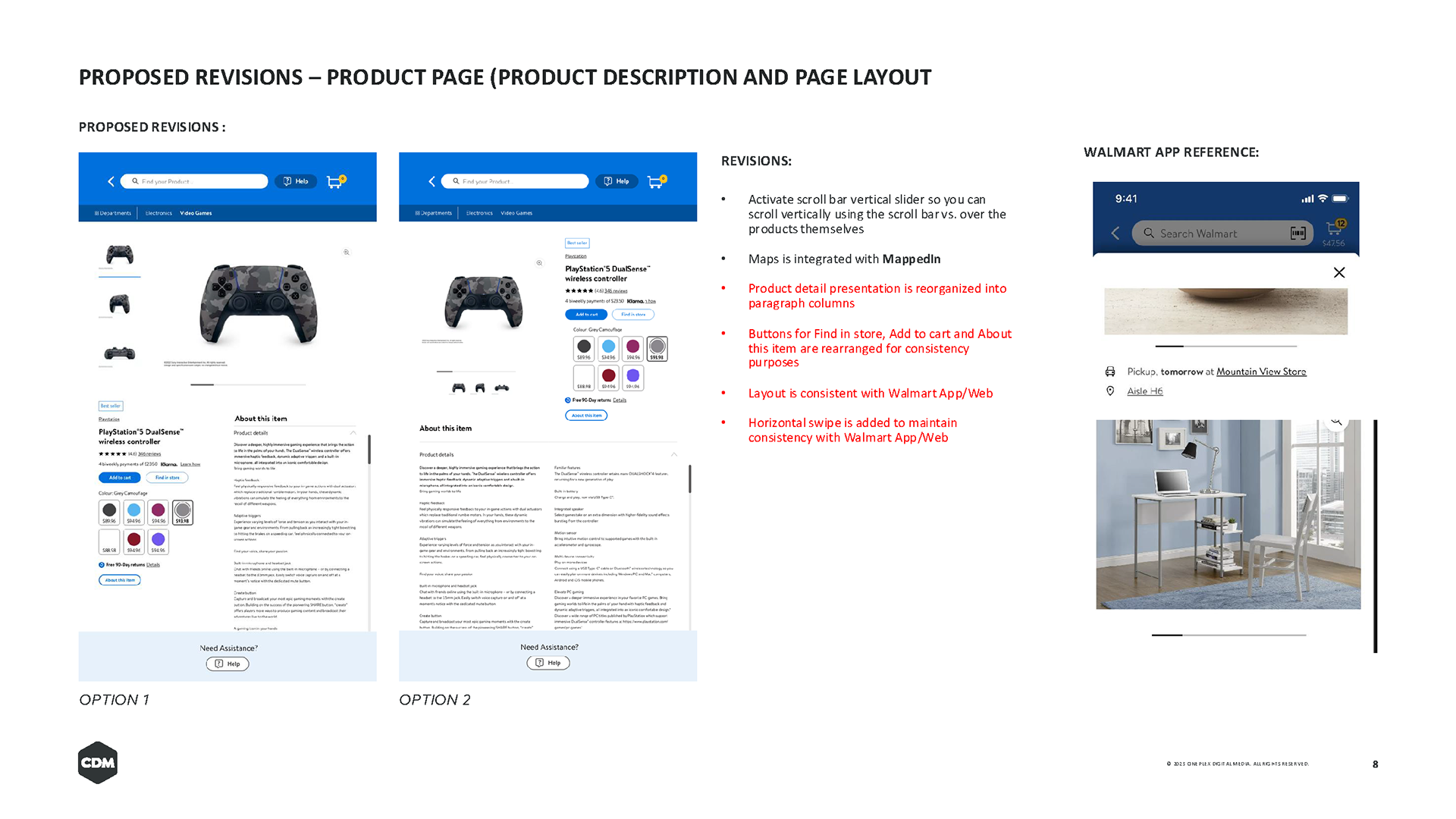
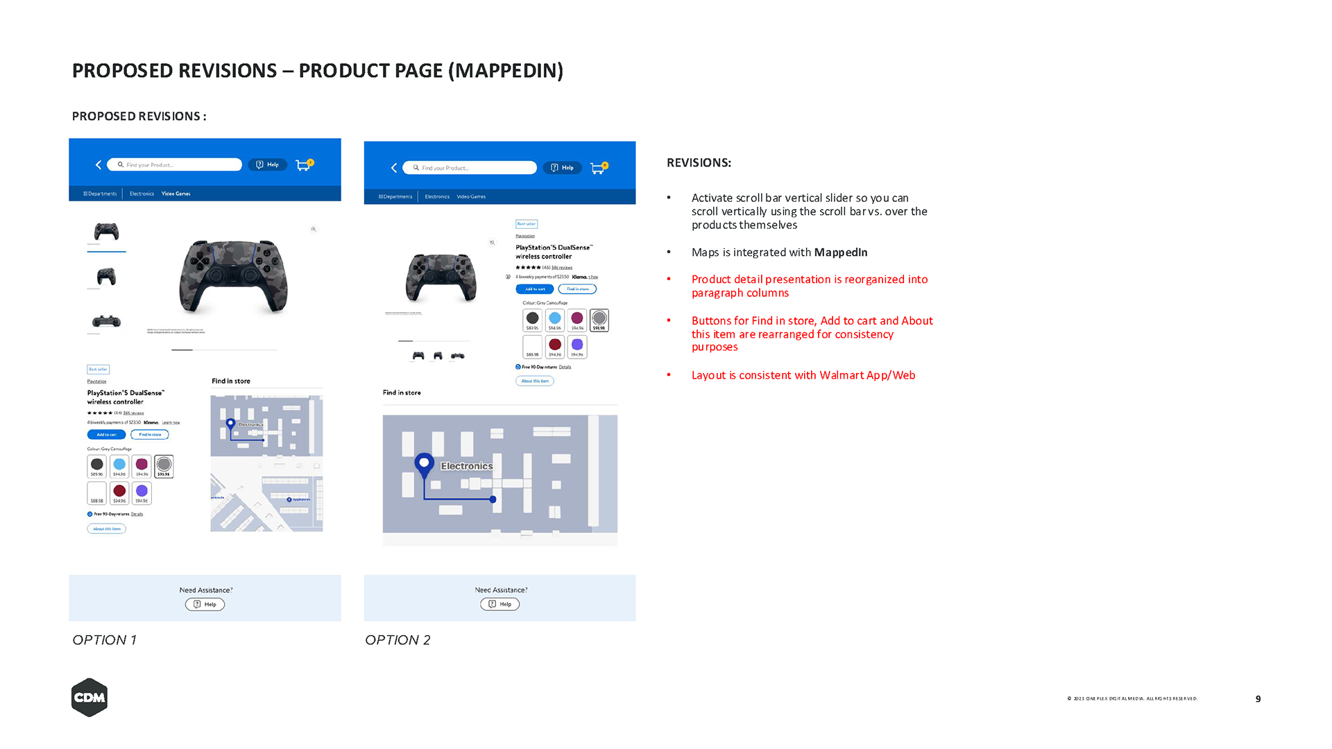
2. Design System Development
Using Walmart’s design system as a foundation, I created an XD-based UI library for the dev team, covering:
Typography hierarchy using Bogle.
Primary and secondary color palettes with contrast ratios documented.
Component library (buttons, modals, input fields, keyboard layouts).
Defined spacing, states, and responsive guidelines.
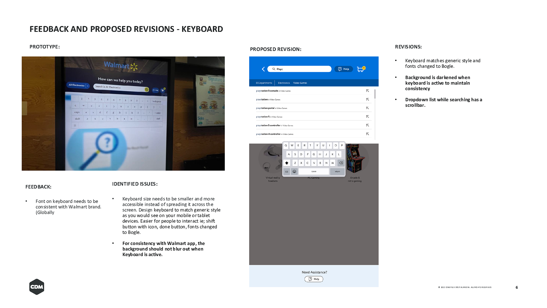
3. Accessibility Recommendations
To improve inclusivity and physical ergonomics:
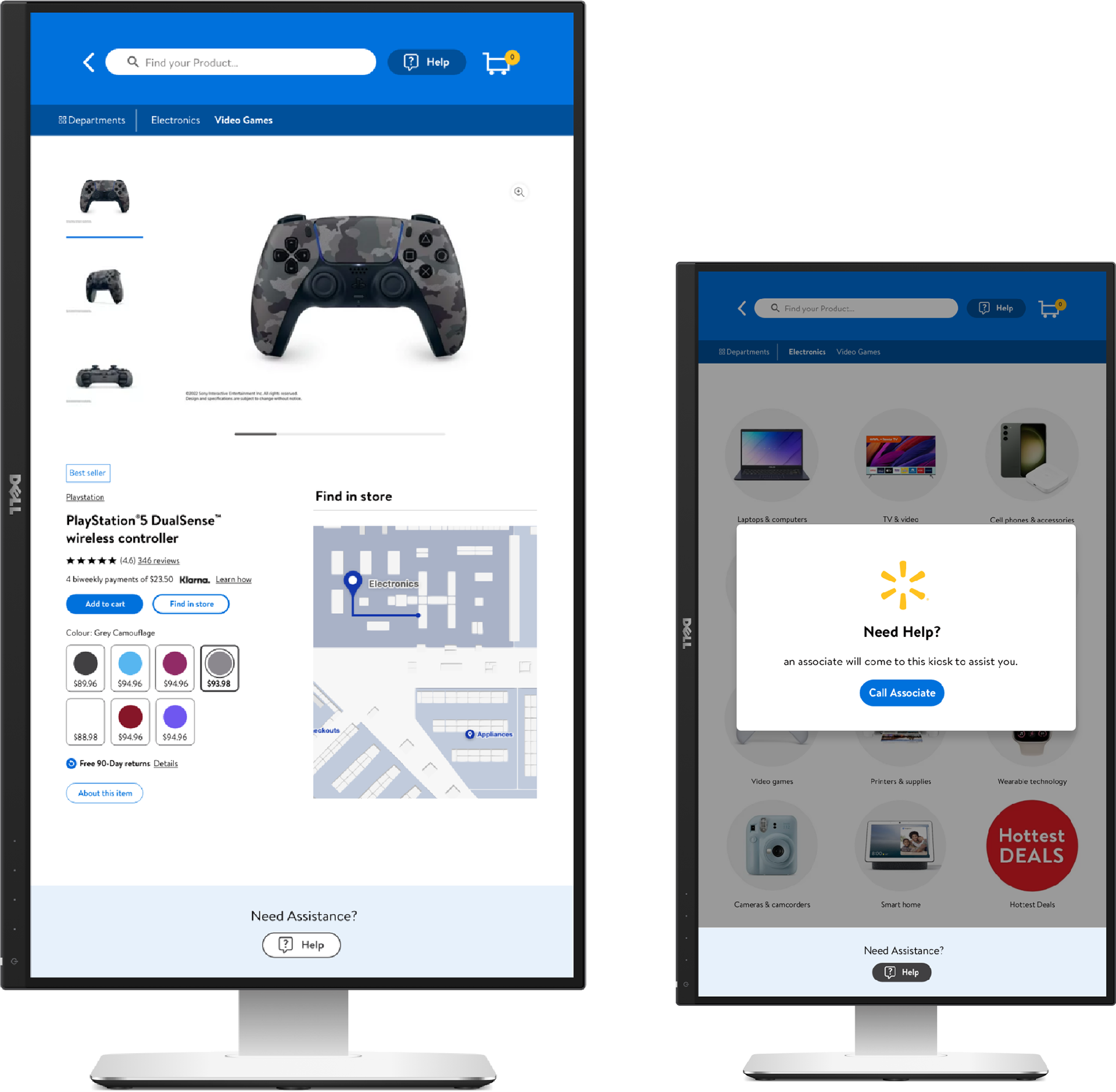
Increased tap areas and adjusted layout spacing.
Recommended high-contrast color pairings (meeting WCAG 2.1 AA).
Suggested dynamic vertical scrolling for accessibility across screen heights.
Redesigned the on-screen keyboard for better visibility and touch accuracy.
4. Internal Presentation
I prepared and presented a detailed internal report titled:
“Enhancing User Experience: Implementing Best UI Practices in Accordance with Walmart’s Brand Guidelines and Design System.”
This served as a practical guide for the development and QA teams.
“Enhancing User Experience: Implementing Best UI Practices in Accordance with Walmart’s Brand Guidelines and Design System.”
This served as a practical guide for the development and QA teams.
Impact
The revised design system enhanced:
Brand cohesion, by aligning every UI element with Walmart’s standards.
Accessibility and usability, improving contrast, structure, and ergonomics.
Developer efficiency, with a reusable and documented component library.
The final result was a more inclusive, intuitive, and consistent kiosk experience, reflecting Walmart’s brand promise of accessibility for all customers.